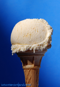
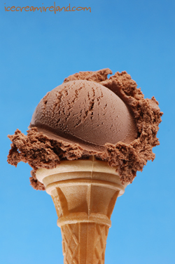
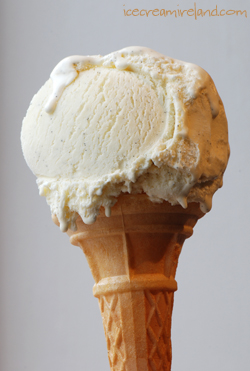
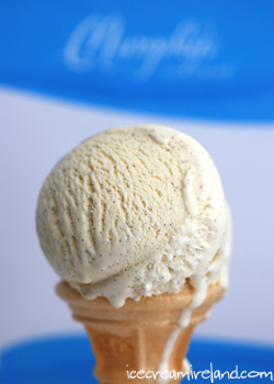
 I’ve been trying to take a photo of an ice cream cone for the front cover of our upcoming ice cream cookbook. I think it’s the hardest thing I’ve tried to photograph, especially since we want it to be melting slightly, which we think makes it look less static. There’s so much humidity in the air that the ice cream tends to frost up before it melts. Anyway, here are a few attempts. The last one is from a few months ago… Now I’m off to the All Ireland. Chiarraí abu!!!


Oh no, Kieran, it’s the chocolate one for sure:)
I know you’re going for a melting look, which must be very difficult to capture, but I really like the second photo (the dark one)… I like the constrast between the smooth curve and the rough fringe of ice cream.
My vote is for the second one, too. The texture of the ice cream is great, and the background isn’t too dark. I like the last one too, but I think the drip down the cone is distracting (and it bums me out when I miss a drip and let that happen when eating a cone). I’ve actually resorted to a hair dryer on one sorbet shot I was trying to get just right. I gotta give the pro food stylists credit–it isn’t easy!
I think if you could do the last one sans drip on cone and have your brand name not be blurry (though I like the blurry blue/white fade from the low f-stop), that would be perfect.
I think you oughtta drop the cone and land a big ol gorgeous scoop of any of those ice creams on a pretty little teaspoon. Yummers, all ice cream all the way!!!!!
But I liked the drippy look of the third photo and the shape of the ice cream of the second photo. Ha Ha, who am I kidding they all look delicious.
I can’t wait to see what cover you choose for the book. I agree, melting ice cream does look so appealing!