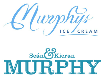
We’re doing a little bit of a rebrand, and I’d love your feedback – here’s our old and new logo. It’s extremely stressful for us to think about changing it, but we’ve had lots of feedback about our old logo being hard to read, especially in a supermarket context.
What do you think? Is it an improvement?
PS. What about the colour?


